

You can customize and tailor your assessment to provide an optimal experience to your respondents.
Since Evalinator aims to offer you a lot of control in how you can configure your assessment, we often preset these settings with “most expected values”. For example, for “Personality” type assessments, the question by question analysis section on the results page is not required. Because of these nuances, these settings for your assessment can sometimes be a bit confusing. This post will explain how to use the settings.
First, there are 2 types of settings:
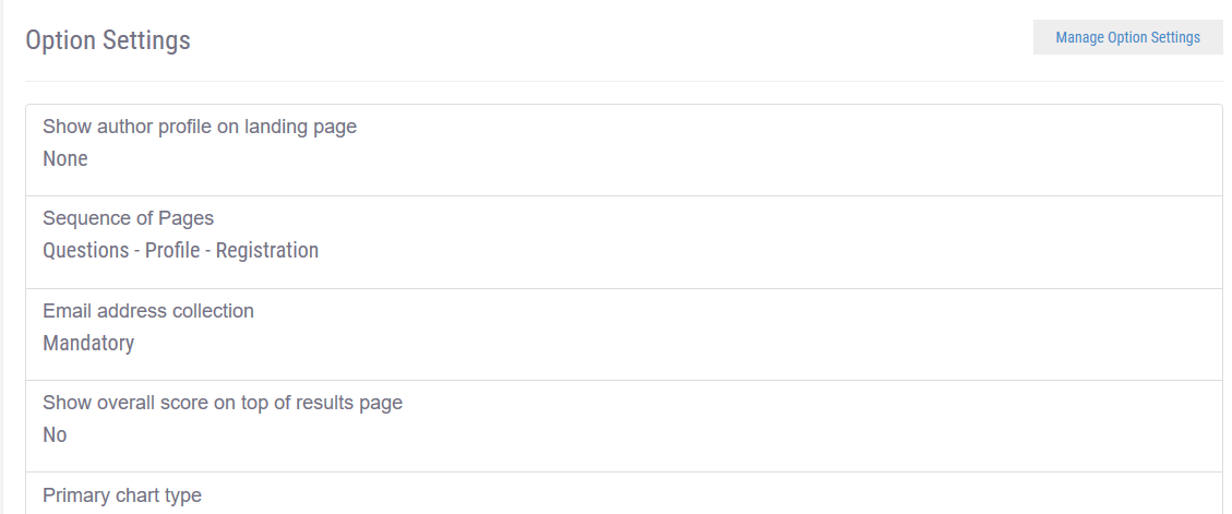
In this post, we’ll cover Options. See screenshot below for reference:

Let’s go over them one by one.
Its reassuring for someone visiting your landing page to see who has authored the assessment. In most cases you will upload your company logo but in many cases you may also want to show the picture of the expert in your company who is already known for their expertise in this knowledge area, or if you are trying to create a brand for them.
This option has 4 settings:
This setting basically helps you decide if you collect the email address information at the beginning, or at the end of the assessment.
It’s often a matter of choice and principles. Some of us may want to have the respondents answer the questions and then throw up the email address collection page hoping that having invested a few minutes already the respondent will be more likely to provide their email address. However the fact that email will be required to see the results may have been mentioned on the landing page.
Others might want to show the email address page first.
This setting allows the respondent to see their results without having to provide their email address.
Most authors will select “Mandatory” here because after all, you have taken the time to provide users with something valuable, so why not get an email address in exchange? But there are experts who want to share freely and let the users decide if they want to subscribe.
For those who are keeping the setting as “Optional”, the hope is that if the user has taken a few minutes to go through the assessment, they may have started to trust you, and are likely to provide their email address to you.
This setting builds on the previous settings and allows you to let users get to the results page without more friction.
Often times, you may want the assessment to be submitted only if the email address is valid. In that case, you will select the option to “Verify email by sending a code“. Evalinator will send a code to the user by email, and only when the user successfully enters the code they received will they be able to proceed to the next stage and see their results. This also helps you capture legitimate email addresses in your marketing automation system. However, this option adds an extra step in the customer journey, and users may abandon the assessment if by chance the code takes longer than a few seconds to arrive.
The other option is to accept the email address as entered. This keeps the user experience seamless, but risks a junk or invalid email address making its way to your marketing automation database. You may want to build in a way to confirm these email addresses.
For Personality and Wheel of Life type of assessments, you may want to set this setting to “No” (default setting).
Pie: Typically used only for personality quizzes.
Bar: Used for comparative scores, and also to benchmark a user’s score against overall average scores across all users. e.g. when a user can fall into one of the three ratings bands of a scored assessment.
Radar: Used for comparisons especially when users can have scores across multiple dimensions in addition to an overall score. e.g. their overall score is 8/10, and this score is an aggregate of their scores across 3 dimensions.
Polar: Generally used for Wheel of Life. Does not show comparisons with other users.
This setting builds on the previous setting and allows you to set what you want to include in your primary chart.
There is no perfect setting so experiment with this, and see what you’d like. Some combinations will just result in an error. e.g. if you select “scores per dimension” and if you have a personality assessment or haven’t created any dimensions.
This is a very useful settings if you’d like to show how a respondent compares to others in aggregate. For example, how everyone else in a particular age range or type of industry scored.
It doesn’t apply, or is not preferable to show, in case of certain situations. For example, if an overall score itself is meaningless, then profile benchmarking also may not make sense. e.g. a personality or a Wheel of Life assessment. In these cases, you may show an overall score, but a comparison based on that overall score will not be very useful.
You may want to show feedback or advice to your users based on their responses. This section is used for that.
For example, you want to give different tips on “actions to take” to users who scored between 8 & 10, versus those that scored between 1 & 3 out of 10.
In some situations such as a Personality Assessment, this is not fully relevant.
This just allows you to further control how you want your users to see their results. For example in case of a scored assessment with multiple dimensions you may just want to show the users score in the radar chart, and not the overall average score.
These settings allow you a lot of control over how you want your assessment to behave. We may add new options and also make it easier for you by presetting them with default values. If you have any questions or requests for new settings, just get in touch with us.
We are rooting for your success!

Feeling frustrated with lead generation?
Take this free, 5-minute quiz and get more prospects into your leads funnel.
Instant Results. Actionable recommendations. Email required.
Find Your Score >>